Selected identity project / Brand identity & print
BluecaddyA fresh perspective on everyday care.
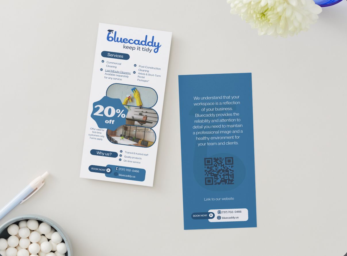
A cleaning-service identity with a confident blue palette and coordinated print collateral.
The intention.
A cleaning-service identity with a confident blue palette and coordinated print collateral. The visual direction brings a shared character to the brand’s different applications.
The expression.
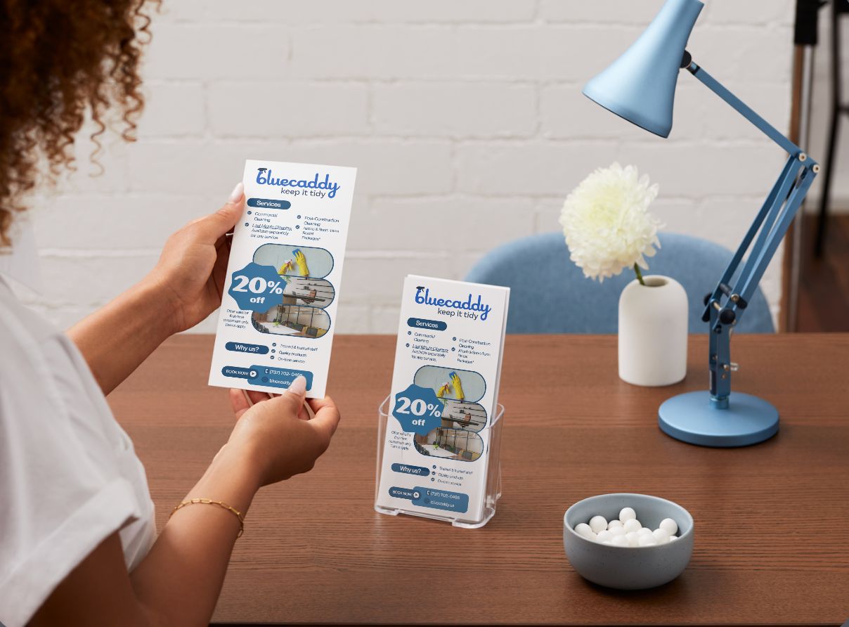
The identity uses clear contrast, a recognizable blue system, and direct layouts to make the service feel approachable and reliable. Flyers and door hangers carry that direction into practical print touchpoints.
The work, in context.
The images show how the identity works across its selected touchpoints, connecting individual pieces through color, typography, and art direction.
From identity to website.
The identity also connects to a website and quote-flow implementation by LumenStack. Explore the development work as a separate part of the collaboration.
Read the website case study at LumenStack ↗